
Overview
Oath is a unique approach to grass-roots fundraising for US democratic political candidates. Created by Brian Derrick, Oath is a way to help younger people get involved with impactful donations to Democratic candidates in the US. Users can select by issue or a voting district to support the candidates to make the biggest impact. The result of countless hours of research and strategy, Oath is a way to do something against to doom-scrolling of American politics. A few weeks ago when Brain launched their first version, I was struck by how much I loved the idea, and that the site was still in a minimum viable product state. Here I’ve proposed a few edits to improve the experience.
Goals
Improve clarity about the product features.
Improve accessibility.
Create a consistent visual language that builds awareness of Oath.
Outcome
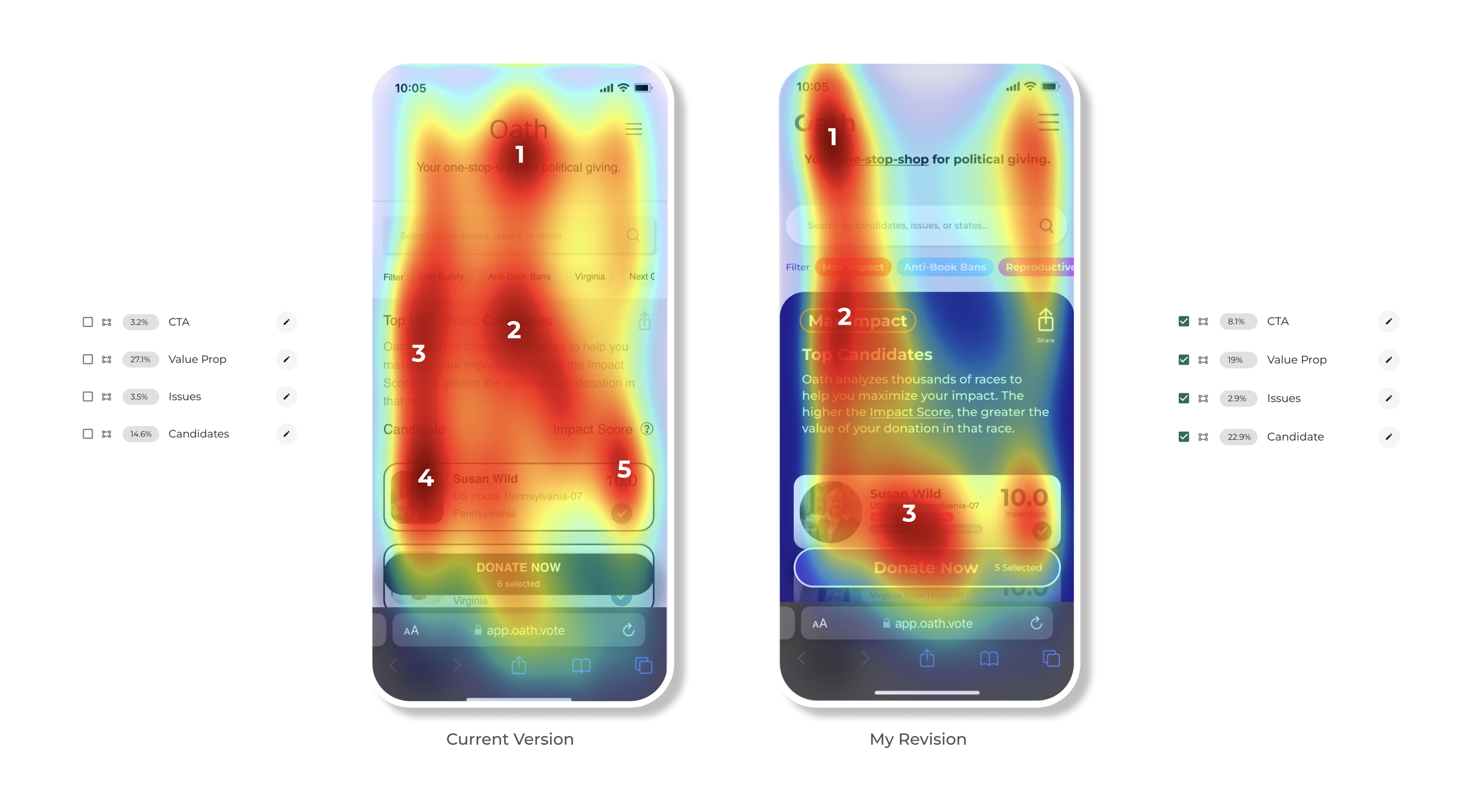
Simplified layout reduces necessary eye movement as testing with simulated eye tracking.
Drove user focus to issues and candidates.
5x more scannable type & increased accessibility.
Design system that helps explain the service.
Team & process
This time the team is just me. The process is a quick-fire application of design interaction heuristics and survey of similar or competing platforms.
Survey of similar platforms or services
Interaction Design Heuristics
Rapid Design Phase tests
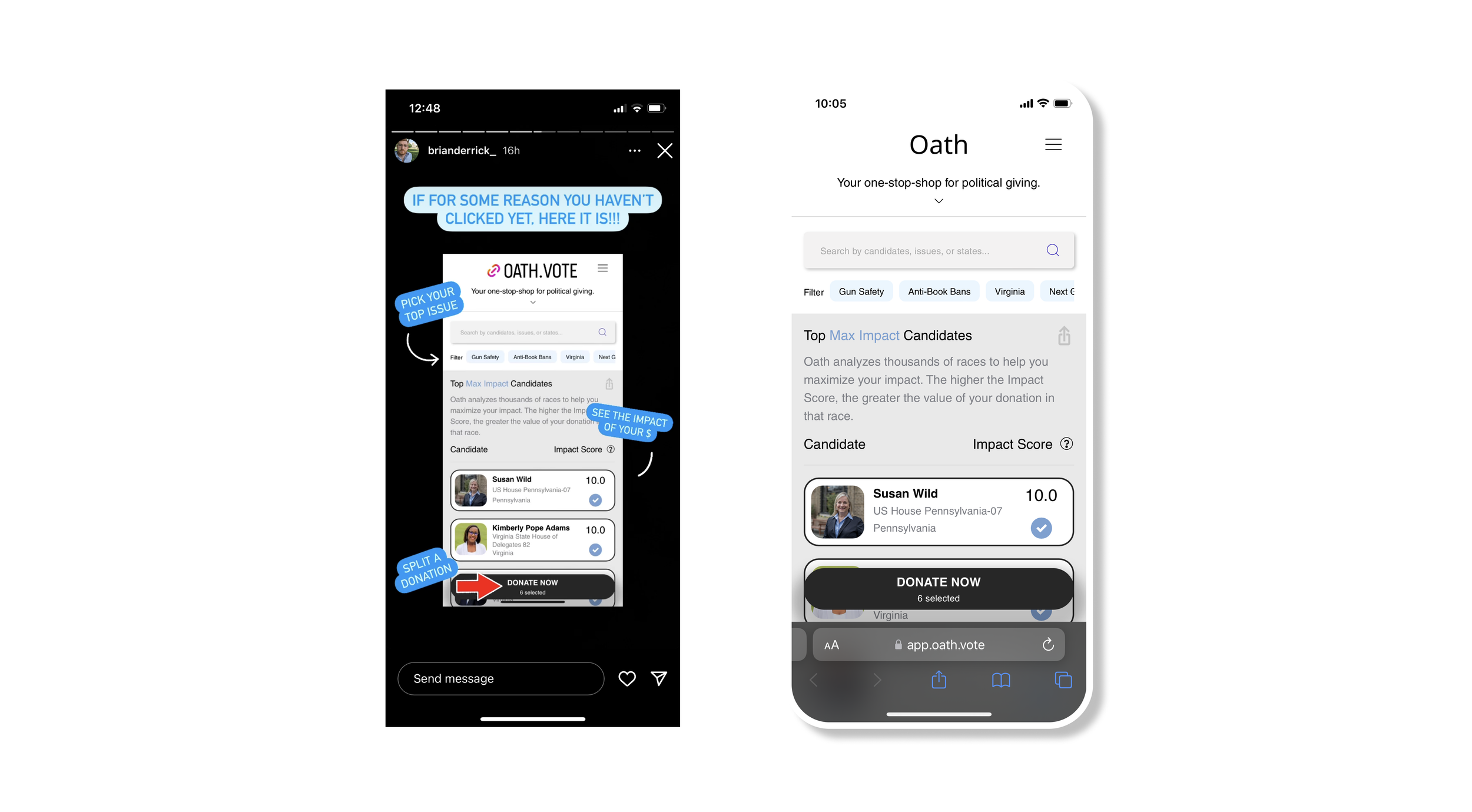
The MVP
The launch MVP for Oath is a perfect minimum viable product, focused, simple and direct. The best place to build from.

Bring Main Function to the Front
The key value of the service is the selection of the most impactful candidates to donate to. A blue background groups the candidate picking section together and brings it to the foreground as the key feature.
Match Between System and Real World Heuristic:
https://www.nngroup.com/articles/match-system-real-world/

Visual Connection Between Issue & Impact
Being able to donate to the most impactful group of candidates around your voting district, state, or a particular issue is an incredible feature. Tagging the issues with a color and repeating them on each candidate helps to visually reinforce and explain the connection.
Visibility of System Status Heuristic:
https://www.nngroup.com/articles/visibility-system-status/

Improve Scanning with Strong Typography
4x increased contrast with type with optimized color and font. This allows the users to more quickly scan the information on the site and often leads to higher levels of comprehension and conversion. Increased legibility allows for a WCAG AAA rating.
Test:
https://webaim.org/resources/contrastchecker/

Details
Icon usability, grouping links to explain terms like “impact score” and branding direction are all smaller scale changes to increase the clarity and focus on the design.
Icon Usability:
https://www.nngroup.com/articles/icon-usability/
In Context Help:
https://www.nngroup.com/videos/just-in-time-help/
Test: Predictive Eye Tracking
The predictive eye-tracking results show increased focus in the new design. An “F” shaped reading pattern is consistent with user scanning behavior. Significantly more attention on the candidate and brand is a good step towards a focusing the page on product features.
We don’t see any attention on the “Issues” and their connection but that is expected. Simulated eye tracking is limited in what it can tell us since we can’t give the AI a particular task (at this time) so the heat map just shows attention. Usage testing, A/B conversion testing or actual eye tracking would be necessary to evaluate perceived visual connections.
Predictive Eye Tracking:
https://expoze.app/

First Round Outcome
While there would be many more steps to fully implement this change to the site, including progressive disclosure of the information about the score, the organization and each candidate, this design succeeds in focusing user attention on the main service the site provides (selecting candidates based on issue) makes strong improvements on clarifying why each candidate is worthy of your support, and is demonstrably clearer and more accessible.
Next steps include: qualitative usability testing with a service like usertesting.com, designing micro interactions and a broader branding exploration to ground Oath with where it wants to go.